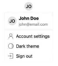
Renders a <UserButton /> component with optional user information, color mode toggle, and extra menu items.
Props
showUserInfo:boolean— Whether to display user information (display name and email) or only show the avatar.colorModeToggle:() => void | Promise<void>— Function to be called when the color mode toggle button is clicked. If specified, a color mode toggle button will be shown.extraItems:Array<{text: string, icon: React.ReactNode, onClick: Function}>— Additional menu items to display.
Example
'use client';
import { UserButton } from '@stackframe/stack';

export default function Page() {
  return (
    <div>
      <h1>User Button</h1>
      <UserButton
        showUserInfo={true}
        colorModeToggle={() => {
          console.log('color mode toggle clicked');
        }}
        extraItems={[
          {
            text: 'Custom Action',
            icon: <CustomIcon />,
            onClick: () => console.log('Custom action clicked'),
          },
        ]}
      />
    </div>
  );
}